
Ocean of Emotion
Teaching children about emotions and helping clean up the Earth's oceans, double duty social good.
Ocean of Emotion is a system designed to help children identify, express and respond to emotions in a fun and interactive manner by playing mini games. In doing so, users will begin to develop empathy for others while learning to recognize and process their own emotions.
Problem
Design a system that teaches children about emotions that also has a social impact.
Solution
The idea for this app came from noticing a gap in the industry where young people who are incapable of speech, haven't yet developed them or who are non-verbal didn’t have any resources to help develop communication and empathy skills in an alternative manner. Along with creating a system to aid with the aforementioned lack of resources, I also wanted to create an accompanying website for the parents, guardians, teachers or therapists who are living and working with these children.
As an avid beach-goer myself, I chose to pair the emotion project with ocean and beach clean-up programs. The overall branding of the project uses fun illustrations to tie in an oceanic theme which is consistent between the mobile app and website versions.
Goal
Ocean of Emotion’s goal is to aid in building a stronger connection between children, their environment and those within it.
I want to provide a safe space for users to explore different emotions and learn how to recognize those emotions in themselves and others creating better communication. Additionally, donations can be made to the organization that help contribute to world-wide ocean cleanup programs for an extra helping of social good.
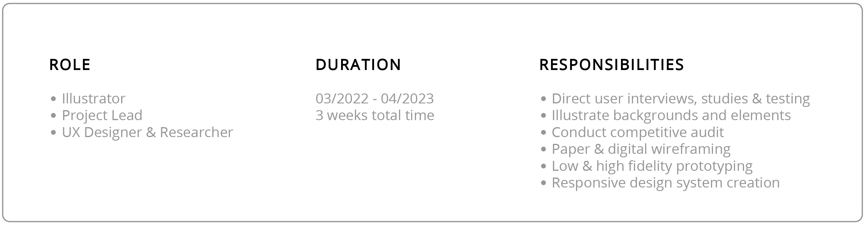
Ideation, Research & Design
I conducted a competitive analysis to get a feel for what types of systems and programs are already available for this type of situation. After looking at 3 competitors, I noticed a gap in the area as none of these programs had a solution for users who don’t primarily communicate vocally. This led me to include Sign Language in my app as well as opportunities for users to learn what emotions may look like as another means of interpretation.
To get to know the folks I was designing this system for, I created some user personas and problem statements. Because I intended to have a mobile app and a companion website, I made a persona for each option. My primary users are children, ages 3-10, who would use the mobile app; and my secondary users are the adults guiding the primary users, who would interact with the companion website.

Problem statement: Mariah is a spunky 4 year old who needs an age appropriate way to learn about emotions and how to express them because she wants to show her parents she can be a big girl and not get put in timeout for temper tantrums.

Problem statement: Jonathan is an electrician with a non-verbal daughter with Autism who needs a program with multiple resources to help kids learn about and recognize emotions because he and his fiancé want to ensure they give their daughter the right tools to communicate with the world in her own way.
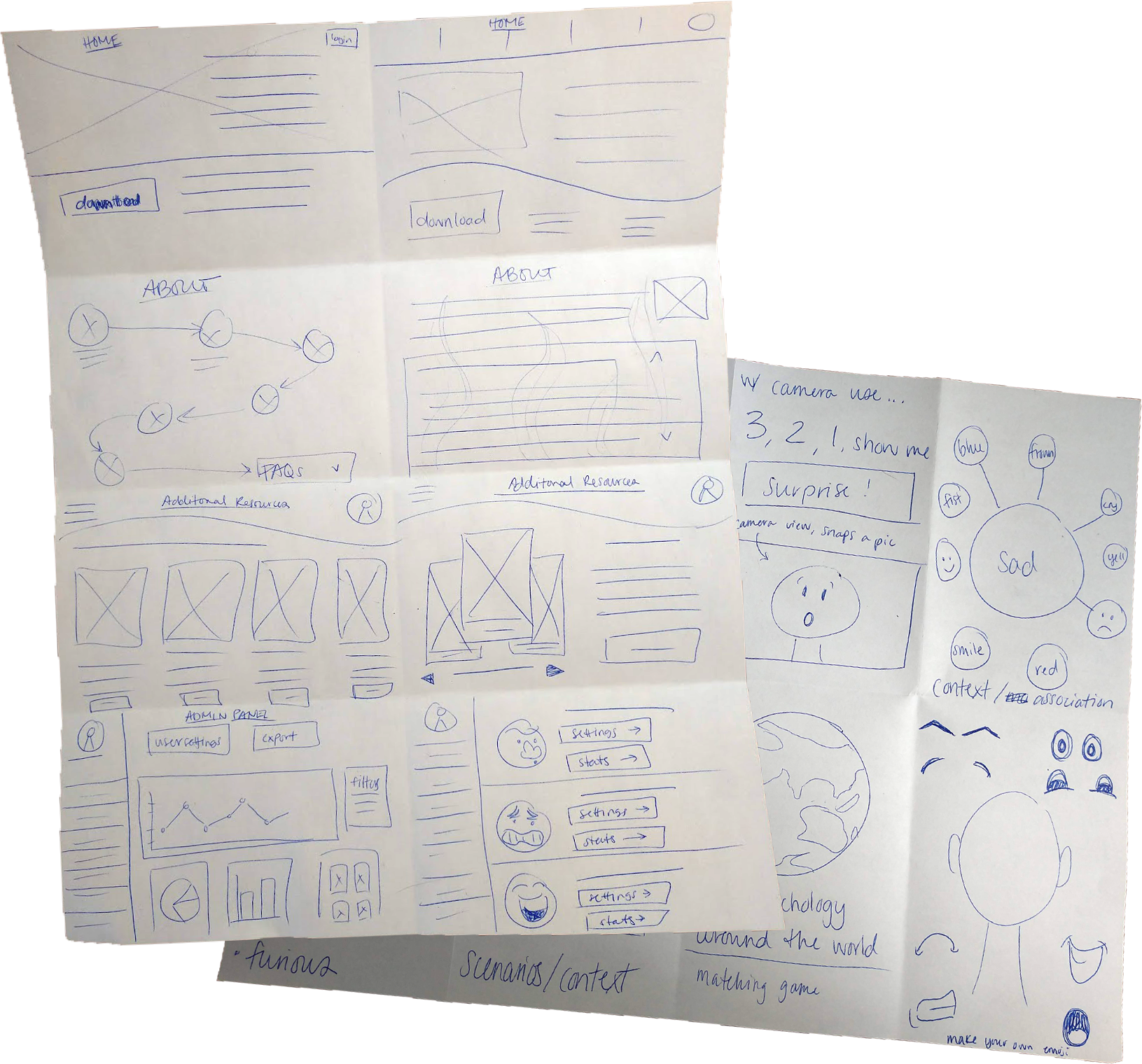
As a visual learner, Crazy 8s is my go-to ideation tool. This exercise allows me to quickly sketch out ideas and then from there, I can pick and choose elements or ideas that make the most sense for the scenario and combine them into a more solid concept. This is also a nice preface to How Might We exercises as I find getting images out of my head allows for alternative solutions to populate. I designed the mobile experience first with the companion website following after.
An in-person usability study was conducted with the low fidelity prototype of the mobile app. Participants were children between the ages of 3-6, parents were present. I had anticipated this study would be challenging as young children have a short attention span and might have trouble with the conceptualization required to interpret a low fidelity version of the app.
That assumption proved to be true but I was also pleasantly surprised by how much I learned about icon recognition, hand gesture preference and how impactful color and imagery are. Maintaining the attention of children under 7 was quite difficult but proved fruitful in the end. The findings from this study were very informative in shaping how users interact with the mobile app.
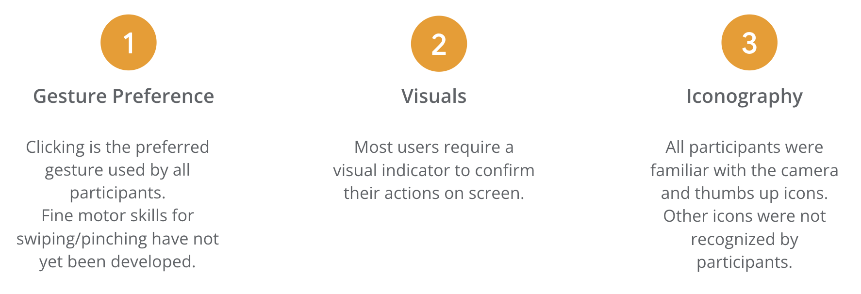
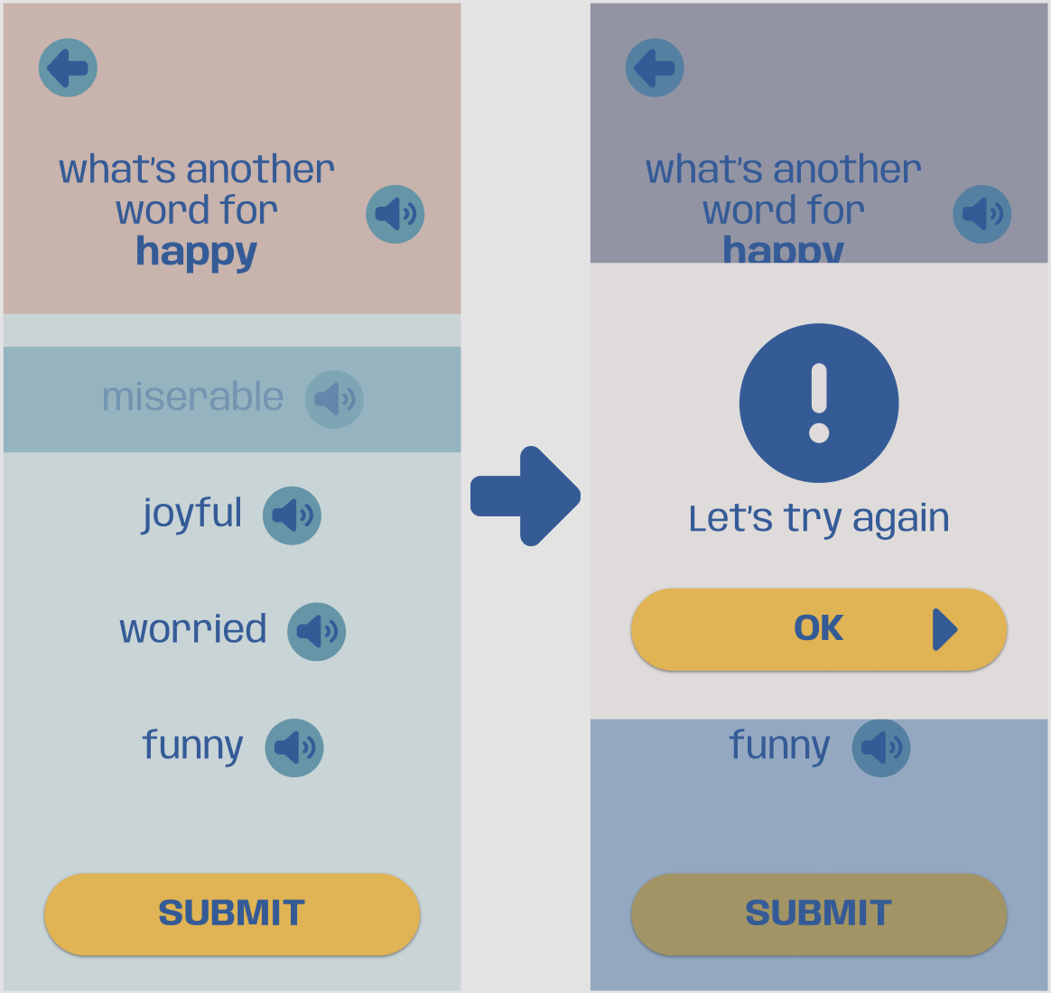
Participant feedback helped me create a more straightforward visual to indicate an incorrect choice was selected. Before making this change, participants were unsure what the greyed out option meant. After closing the popup, the incorrect choice is removed from the screen completely.
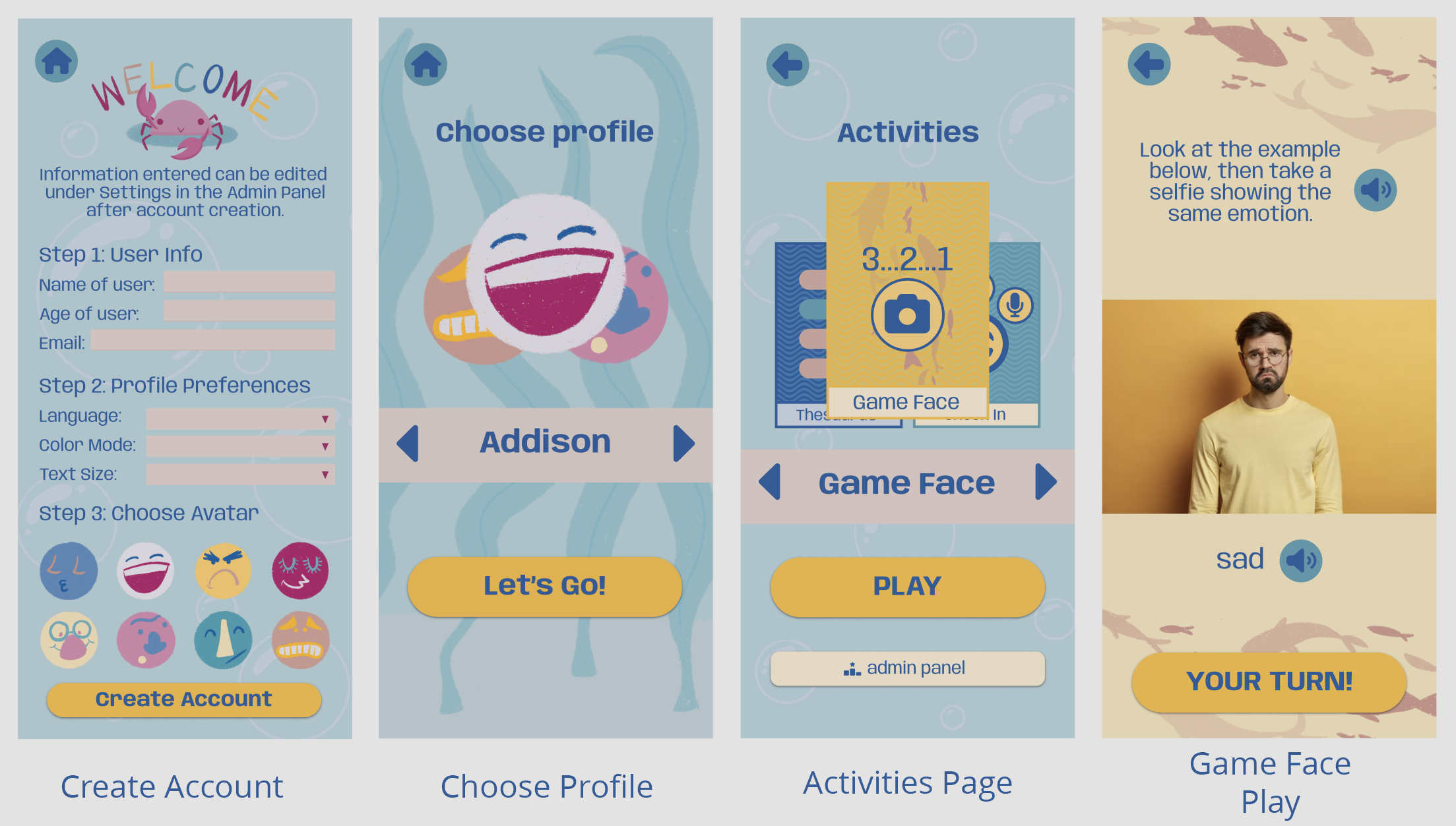
Having both primary and secondary users for connected products means ensuring that everyone can be comfortable and confident when interacting with Ocean of Emotion from any supported device. Research informed me that my target audience mostly engage with mobile devices which led me to design the app to fit both smartphone and tablet sizes. Laptops have become more prevalent than desktops so my web design was created with that device as the primary size. For the mobile app, I paid close attention to creating a fun look that kids would want to play with without it being too bright which some might find overwhelming. The website has a more official look to it, but I kept some of the whimsical elements from the app for consistency.
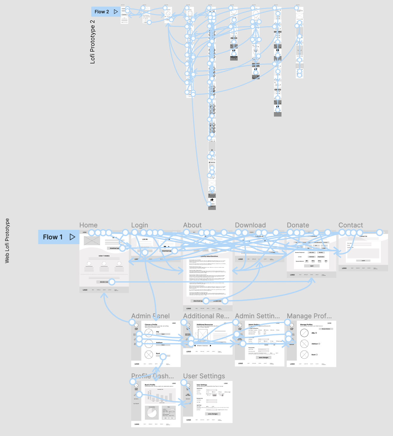
Check out the mobile prototype here, or the web prototype here
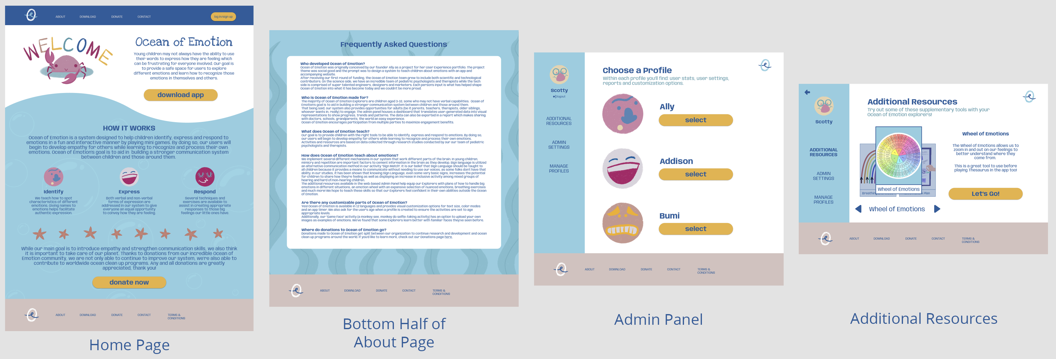
This website has 2 parts, the main flow that informs viewers as to what Ocean of Emotion is about, how we utilize resources and create activities, and where to download the mobile app. The second part requires logging in to access a more extensive version of the admin panel than what is available in the mobile app, featuring additional resources and exportable stat reports for each user.
Takeaways & Next Steps
“I wish this was a real product, my pediatric patients would love it!” - Quote from an occupational therapist that participated in a usability study.
I think that this product would help families around the world become closer and that the children who use the app would use the empathy learned to spread kindness. Creating a system that addresses the lack of resources for a very real population will not only fill that gap, it also creates a tool that many others will benefit from as well. The additional factor of donating to ocean clean up programs would bring more attention to the human impact on our planet and encourage others to participate in their own way.
Working on this project, I learned to look for the gaps and find solutions that benefit many. I also learned that even the youngest users who may not fully comprehend what’s being asked of them can still provide valuable feedback that would never have been uncovered without accepting the challenge of working with them.
I have a few ideas of what I'd like to work on next for Ocean of Emotion to continue to improve the idea and experience. I’d really like to figure out how to make the sound buttons functional in the prototypes. I think that would add another layer of realism to how I envision the final product functioning. I did a majority of the illustrations for this app but there were some images/icons I used from other sources due to time constraints. I’d love to go back in and make this a fully self-made design system. I’d also like to do another usability study of the hifi prototype with more kids. They have a unique perspective of the world and I really think I could learn more from them.
Thank you for taking the time to read this case study! Please feel free to check out my other projects or send a message if you have questions or would like to get in contact with me.