Then Again
Mission style adventures making museums and galleries an interactive experience.
Then Again is a mobile app making the art gallery experience exciting and interactive by sending users on mission style adventures; answering clues and riddles while working their way through exhibits to earn treasure upon completion.
Problem
Create an art history app to draw new crowds into art galleries and museums.
Solution
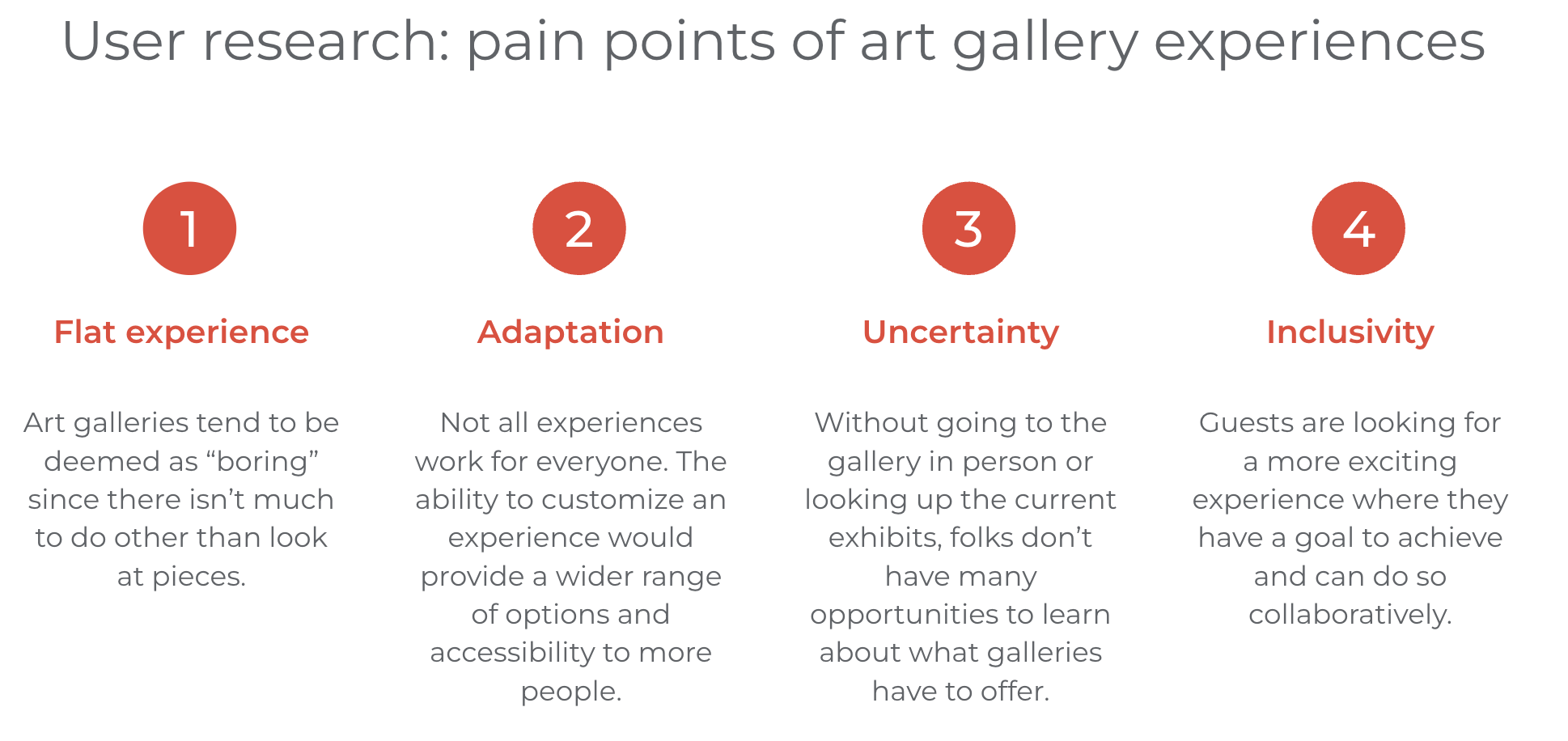
Traditionally, the experience of visiting an art gallery is not one that elicits feelings of excitement or really involves patrons in any way. Then Again turns that notion on its head as a mobile app that is designed to create an interactive experience for art gallery guests by sending them on mission-style adventures through exhibits, collecting a treasure at the end of each successful mission. Not everyone has the inclination to spend hours viewing art pieces in search of really getting it. These days, folks are more so looking for activities that require brain power in a different way and many prefer cooperative challenges.
Goal
Create a mobile app that entices a new audience to art museums and galleries that also allows users to schedule and purchase tickets with ease.
Knowing what you're getting yourself into is half the battle of deciding what you want to do. Then Again allows users to research where they'd like to visit, what is available at that location and when the ideal time to schedule a trip is. Then Again is reinvigorating the gallery and museum scene by inviting new users to experience art in a fun way that is driven by a common goal.
Research, Methodology & Design
To get a feel for what types of art history apps already exist, I conducted a competitive audit looking at two direct competitors and one indirect. In reviewing the competition, none of them were actually getting people to go to galleries and museums in person, instead showing digital versions of the artwork to be explored. I also noticed that there was a very few languages these products were available to be translated to. Another opportunity I identified was giving users the ability to filter and apply specific search criteria within the app to narrow down topics.
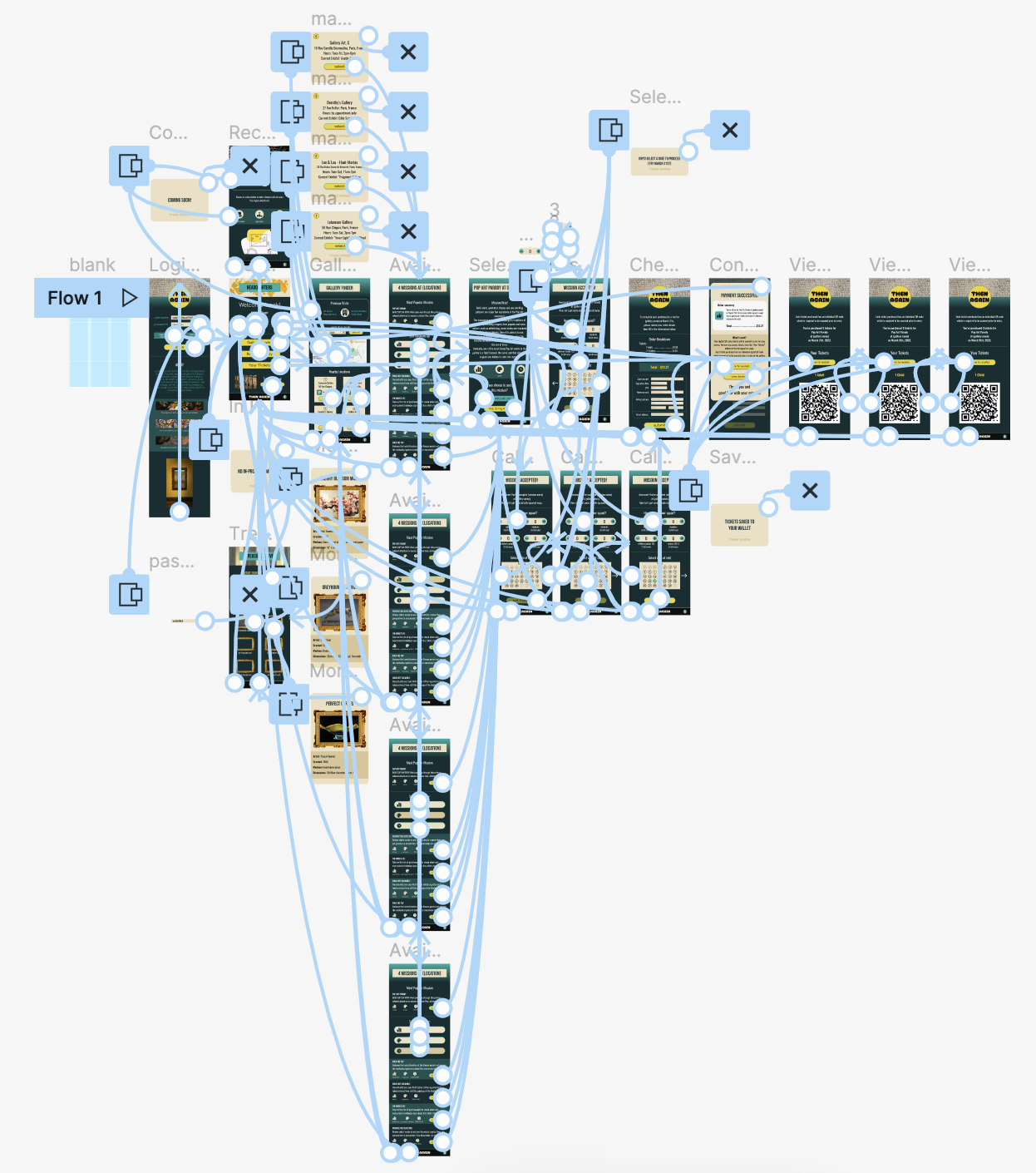
Prior to designing, I like to take some time to think about the information architecture. This includes drawing out a site map and considering the user flow for main tasks within the app.

With all my research compiled, the design process could begin. I like to start with pen and paper as it allows the fastest transfer of ideas from head to hand.
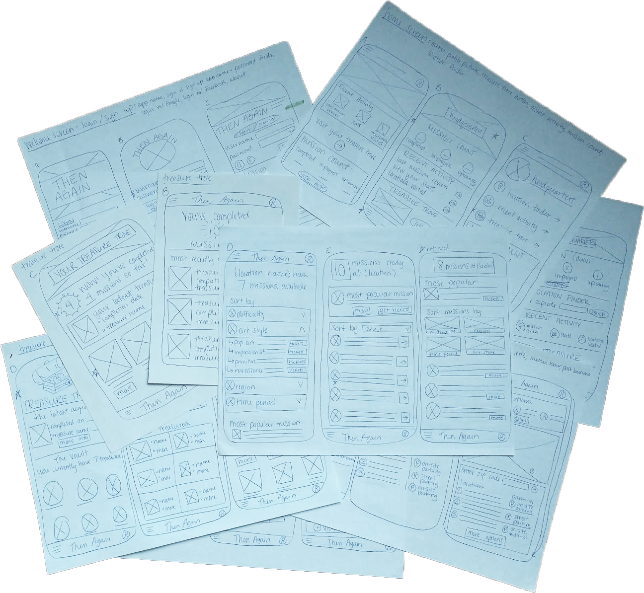
Before adding in all the fun details like color, imagery and animations, I had to make sure that the elements were in the optimal positions in my digital wireframes to create an intuitive interface for users. Iteration based on feedback is an important step in making things make sense!
Identifying target users for this app initially proved easy as I fall into that category. This fact also made me more aware of how important it would be to think like someone who doesn't have the same background and exposure to art history and galleries that I have. Creating an app that is enticing to folks who may not have ever thought they'd find themselves in an art gallery by choice remained at the top of my mind throughout the entire process. My participant criteria for this project can be summarized by the following qualities:
- between the ages of 18-70
- should reside in an area with access to an art gallery or travel specifically to visit galleries
- must represent a variety of genders across the spectrum and include: at least one participant with a visual impairment and at least one participant whose first language was not English
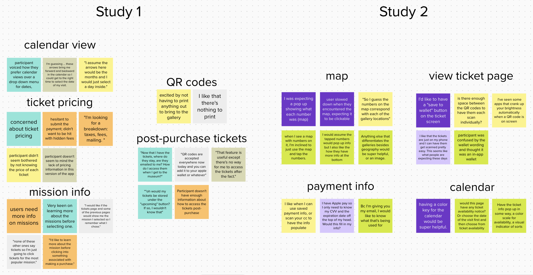
Two hybrid remote/in-person moderated usability studies were performed. Both consisted of 5 participants who followed verbal prompts to log in to the app and go through the process for purchasing tickets to an art gallery for a specific date. Participants then completed a usability survey about their experience with the app on their own via Google Forms. Both studies confirmed initial assumptions that calendar views are preferred for scheduling and easy access to digital tickets post-purchase is a priority for most users.
Based on user feedback and form responses, I made affinity maps to call out patterns and insights for areas of improvement. Required design updates were made to ensure that users are able to complete the actions necessary for ticket purchase in an enjoyable manner for a high conversion and a low drop-off rate.
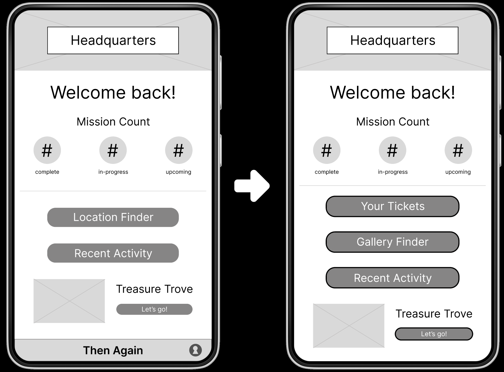
After logging in, users land on the Headquarters page where they have a quick overview of their missions as well as navigational tools to move into different areas of the app. Here's a before and after of the Headquarters page with some changes made - I added in the "Your Tickets" button as all users remarked that they needed an easy way to access their tickets after purchasing as well as clarifying the language of the "Location Finder" button to be more representative of what users can expect when clicking it.
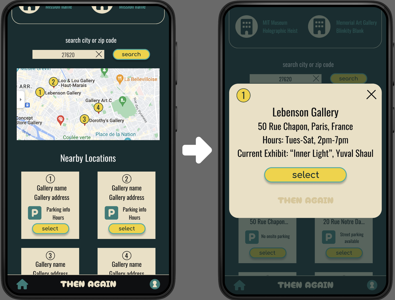
After usability testing, it was made apparent that the elements needed more room to breathe and users expected to see ticket prices before selecting them. The second usability study demonstrated that nearly all users expected to be able to interact with the map. To build upon this expectation, I made the numbers on the map connect to a modal which provides users with more detailed information when tapped.
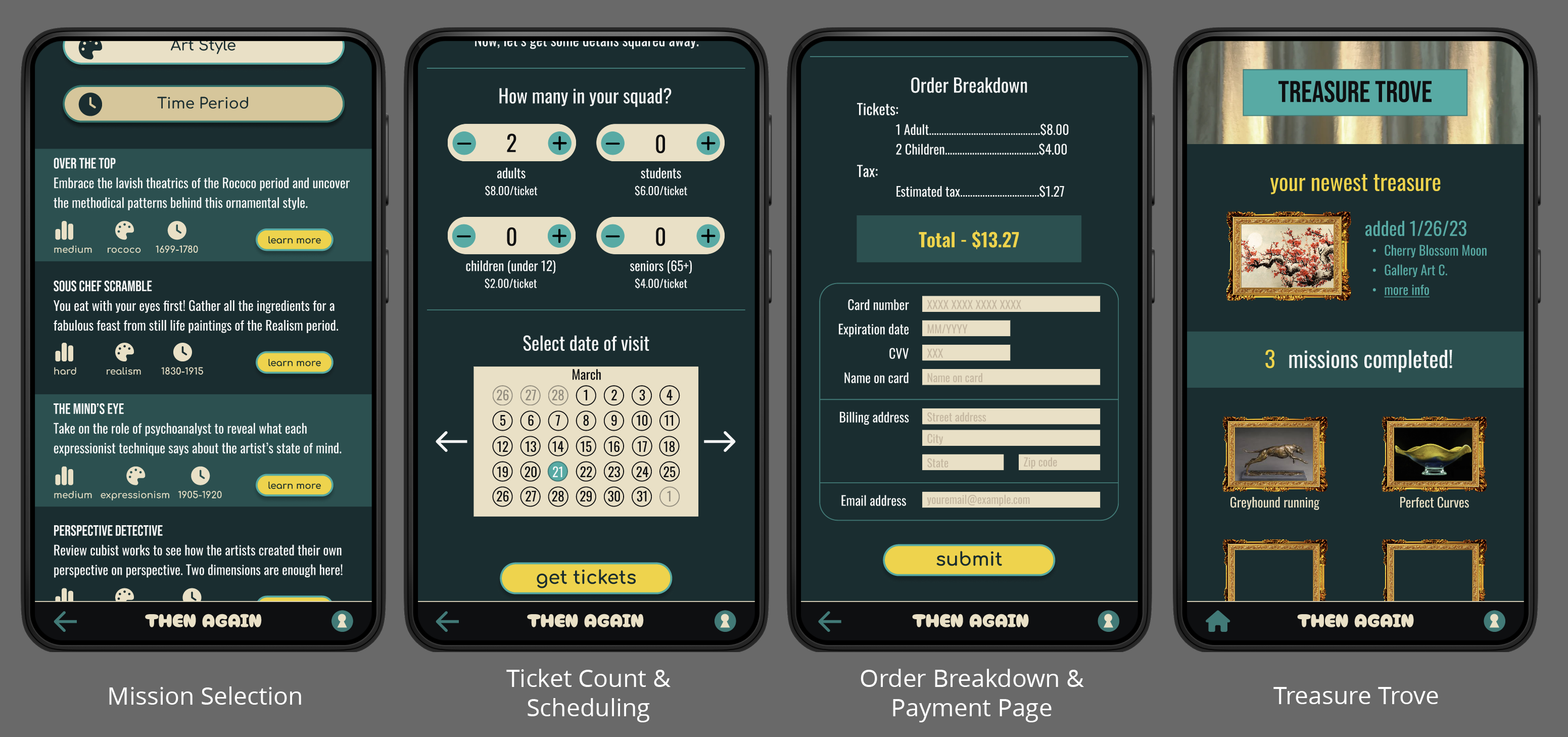
Considering the environment in which this app would be used helped me decide on the overall theming. I chose a dark background with contrasting bright yellow for the button colors to show users where they need to click to proceed. The dark background also helps to lessen light pollution in a gallery or museum setting protecting the delicate works of art and other patrons' experiences from being interrupted.
Try out the high fidelity prototype here
Takeaways & Next Steps
Then Again provides a one stop shop for folks looking for a new spin on a familiar activity. Presenting what used to be an exclusive environment as a welcoming adventure for people of all walks of life will not only benefit visitors, but also the museums or galleries that provide the experience. A quote from one study, “After this experience, I wish all galleries and museums had something like this in place! I'd definitely visit more often if they did.”
To continue iterating on and improving this project, I'd like to work on creating and implementing a color-coded ticket availability system to the calendar. Feedback from the second usability study indicated this would be a helpful feature. I'd conduct research on what should be included in a User Account section as this aspect of the app has not been built out yet, but will be necessary for Accessibility and Language settings. Finally, conducting another usability study to validate that user pain-points have been addressed and hear feedback about initial User Account screens would round out the next phase of the app.
Thank you for taking the time to read this case study! Please feel free to check out my other projects or send a message if you have questions or would like to get in contact with me.