
RIVH Site Design
Responsive website design for a (fictitious) local veterinary hospital.
The Rhode Island Veterinary Hospital needed a brand refresh along with a website redesign focusing on improving the new pet registration process.
Problem
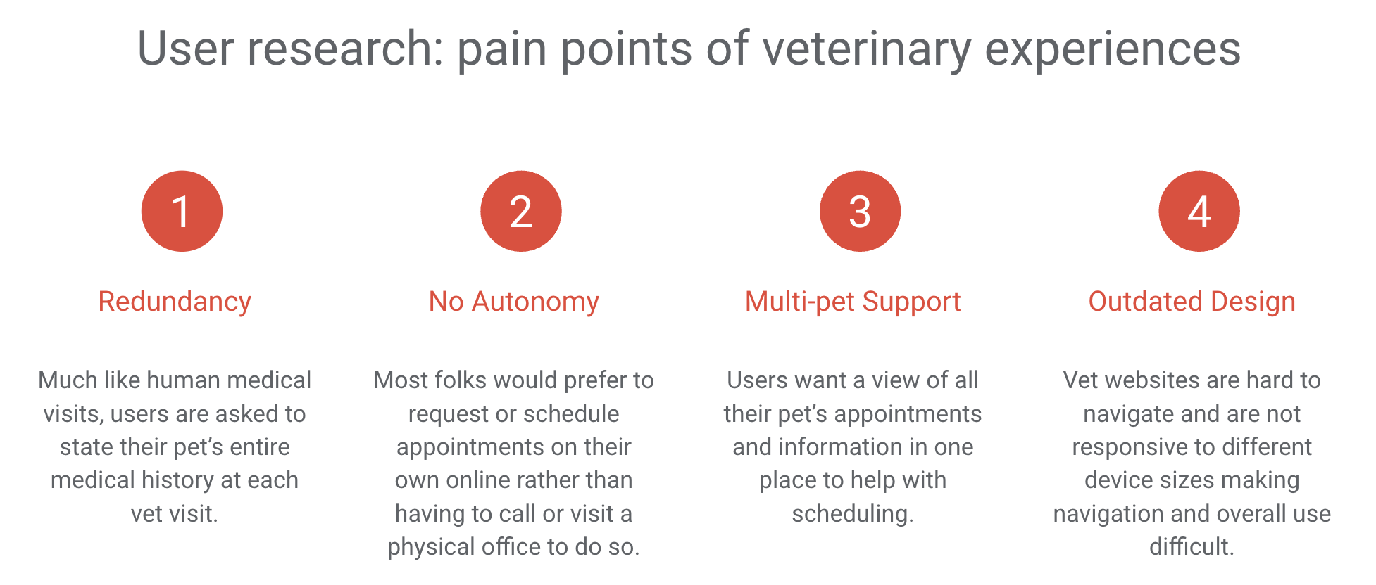
As with the human medical system, the experience of collecting pet patient information is stuck in the past.
Existing systems create more work for both users and staff who interact with them. From redundant information entry to the inability to perform any actions autonomously, these systems are out of date and are in desperate need of an overhaul.
Solution
Design a new website experience that provides veterinary staff with all the essentials required for daily duties while maintaining ease of use for clients using a refreshed branding package. By providing user autonomy to perform certain tasks, we will free up time for veterinary staff to keep focus on what matters most, your pet.
Goal
Reduce the stressors that come with any medical interaction by creating a platform that is uncomplicated and invites user collaboration where needed.
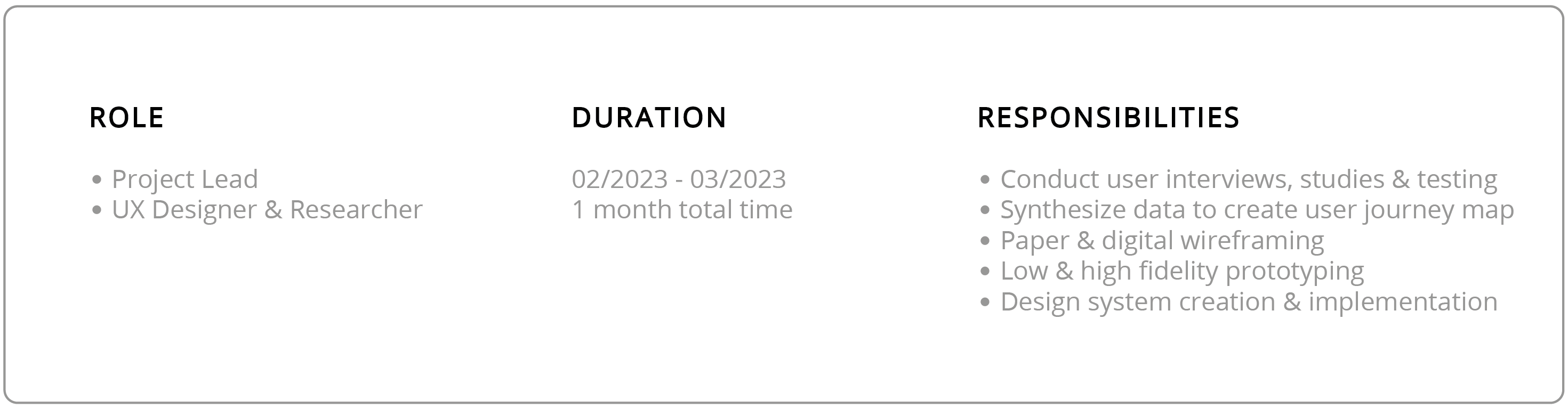
Research, Methodology & Design
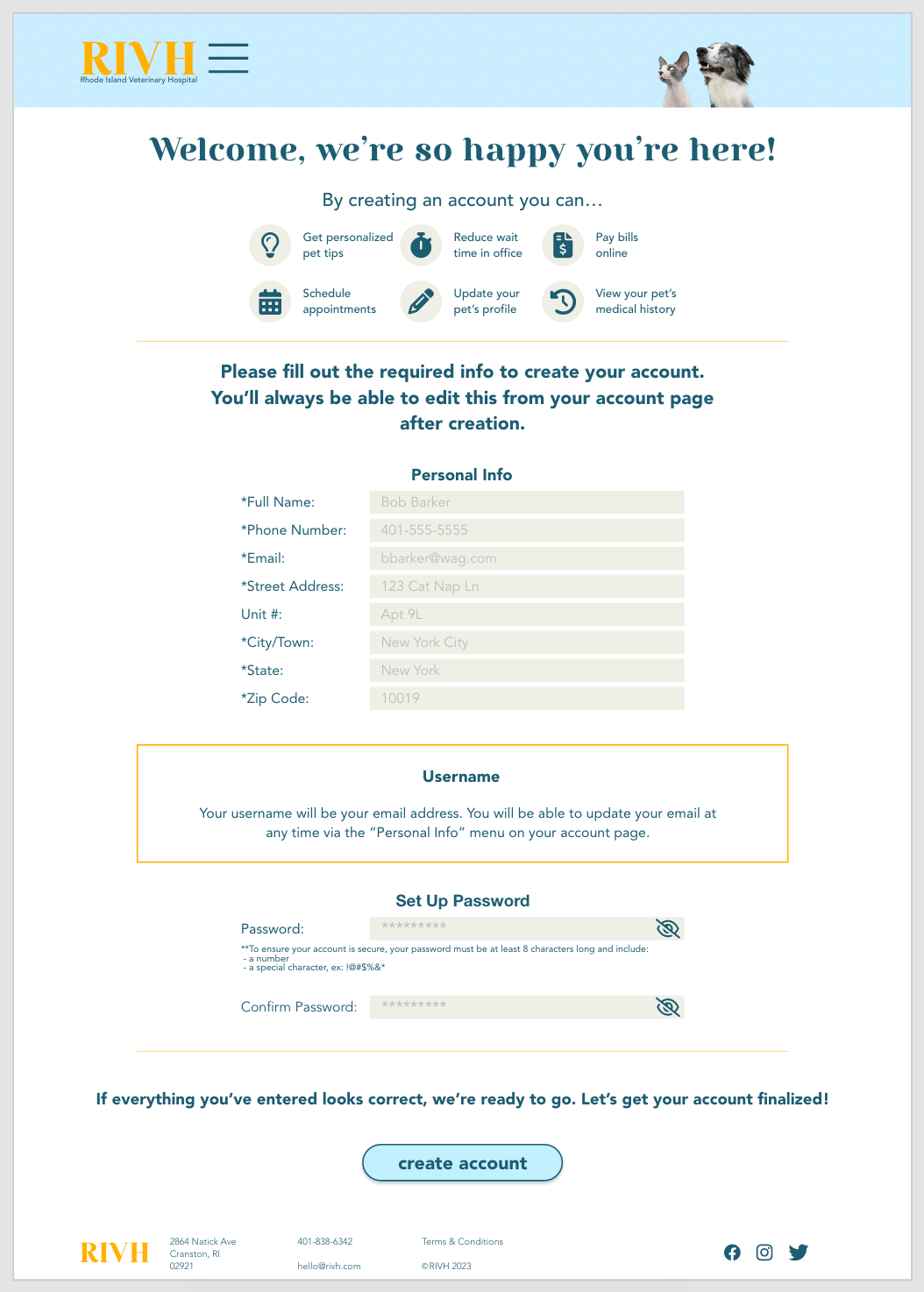
After conducting interviews to identify target users and their pain points, usability studies were performed to determine what steps of the pet registration process can be streamlined and what aspects need to remain as vital for veterinary industry integrity. Affinity maps were created based on user feedback and direct quotes about specific pain points or areas of delight in current systems. With the insights gained, necessary tweaks were made to my design ensure that users are able to complete the actions required for adding a new pet to an existing or newly created account with ease.
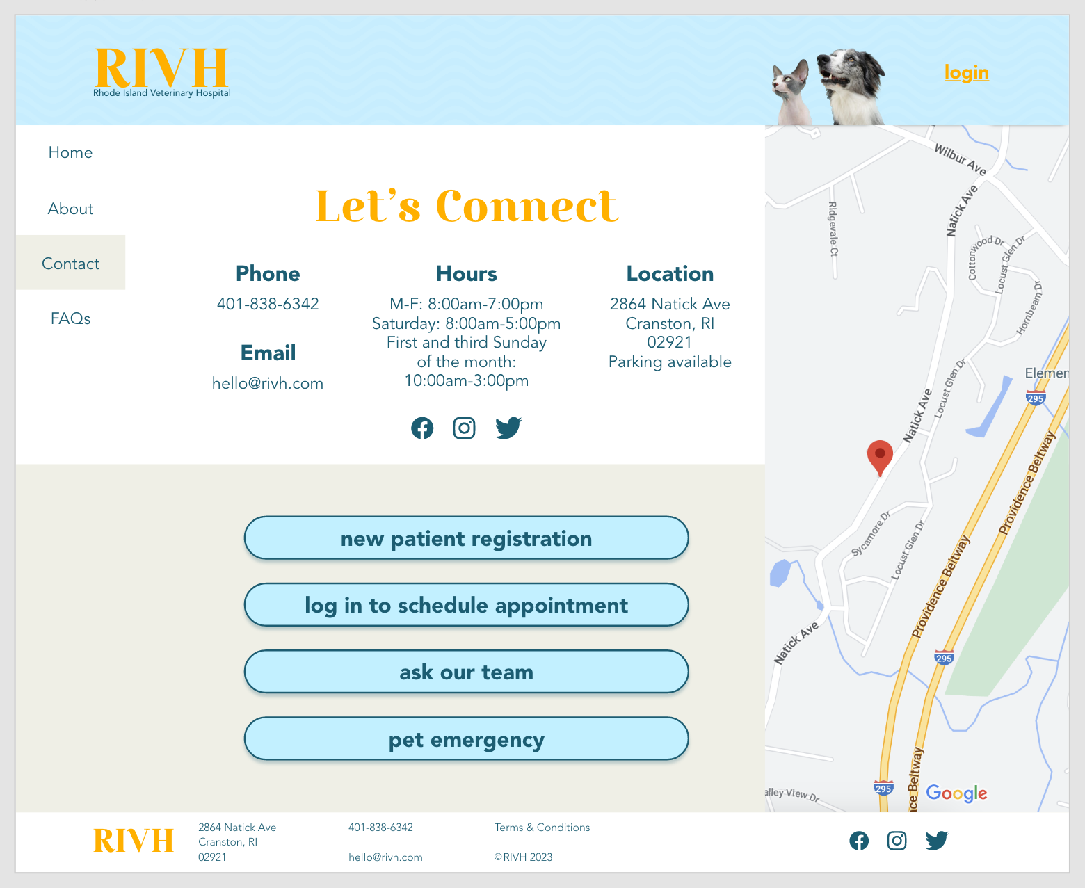
Two remote moderated usability studies were conducted, consisting of 5 participants following prompts leading them through the process of adding a new pet to an account on the RIVH website prototypes. Participants in the second study also completed a system usability survey after their experience with the high fidelity prototype. Both studies confirmed initial assumptions that the ability to create an account needs to be prominent on the home page as well as the need for clear language around upcoming pet appointments.
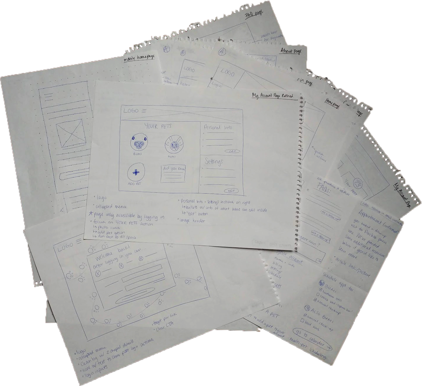
Paper ideation sketches and wireframes were transformed into digital wireframes to create a lofi prototype for initial user testing.
Ensuring that my participants owned a variety of pet species was an integral part of the study as they were able to provide feedback on aspects of veterinary interactions I myself have not experienced. This helped me create a flow that only displays relevant information to users based on what their unique needs are, saving time and frustration while providing a personalized experience.
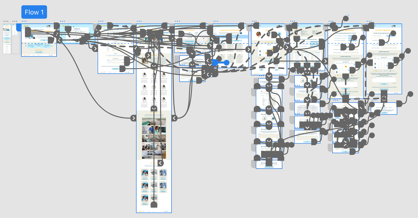
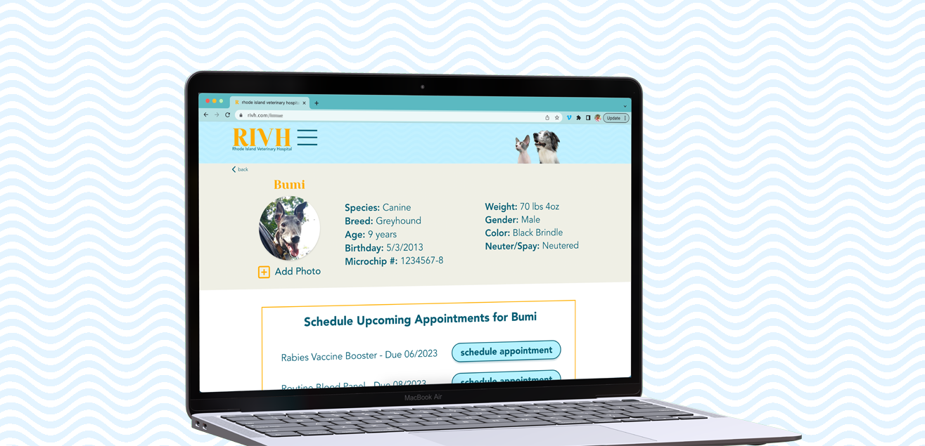
Check out the high fidelity web prototype here
Takeaways
Pet parents are looking for transparency into their pet's health records, an easy mode of communication with the vet staff, as well as access to perform actions like scheduling, asking questions and adding information online, on their own time.
I learned that simplicity and clear, honest communication are key elements to creating an enjoyable experience for users in this scenario. After interviews, testing and many design iterations, I believe I have fulfilled the needs of both pet owners and the staff of the veterinary hospital with this site and flow redesign.

Thank you for taking the time to read this case study! Please feel free to check out my other projects or send a message if you have questions or would like to get in contact with me.